Sunday, May 31, 2009

Now that I have organized my photos and ideas, I came to the conclusion and theme of my magazine.  It's going to be a "conflict & resolution" magazine for urban/modern life styles.  There are going to be four different sections of four different people and issues in their life.  There will be a photo shoot type layout on these people, and a headline of their "conflict" with a possible "resolution".  The article following each section will correlate with the resolution.  So now I just have to finish it and finalize each layout/spread.


Picture updates...


Wednesday, May 13, 2009


Here are some pictures I took with the intentions of using them in my magazine.  Now, I really have to figure out the exact point of my magazine so I can decide which photos (if any) I would like to use.


Friday, May 8, 2009

This weekend seems like it's going to be pretty nice so I'm going to use it to my advantage...and do a photoshoot. A couple years ago I went to this place about an hour outside of portland and stumbled upon an abandoned logging building (I'm not sure what the correct term is), but it's right next to a lake with a big cement trench leading into it. It appears as if it had been burt down quite some time ago and all that was left was the stone walls; no doors, no windows, no roof. Just the outer inner shell. From the outside, it was really nothing special, but the inside was somewhat astonishing. There was a little forrest growing on the inside, big trees had grown and were reaching all the way up the walls, forming a canopy rooftop. There was grass and flowers on the ground, and the walls were covered in grafitti. All the cavities (where windows used to be) proved to be a great light source on a sunny day, and ever since I saw this place I have been dying to take photos of something in it, but never got around to it. So this project inspired me to finally do it. I really want to do a fashion magazine, so I was thinking about doing an on-location photoshoot here (and later in other places)-and test out my photography skills. It should be fun, and I can't wait to see the result! I'll post up pictures when I'm done.

Wednesday, May 6, 2009

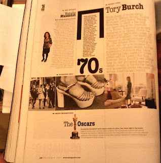
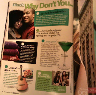
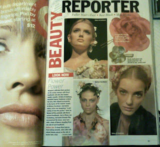
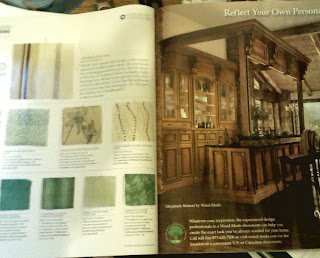
I started out by just grabbing all the magazines I could find that were appealing to me. Then I narrowed it down a bit, and decided to pick out three different types of magazines, which ended up being: Fashion (Vouge, Allure, W) Music (Interview, Rolling Stone) and Home (House Beautiful). I really wanted to design my magazine layouts after the fashion magazines, but I had a hard time finding many good layouts. They seemed to mostly rely on the photography, which would be cool, but I don’t want to necessarily depend on myself taking pictures of that quality. I actually found some of the best spreads in the House Beautiful magazine. They used a lot of nice grids and had good image and text relationships. Vouge liked to keep things simple, by having really large fashionable images, and plain text put into rows, often times putting emphasis on the beginning letters of paragraphs by enlarging the font size and changing the color. I did find a few fashion spreads that caught my eye though, and I really want to incorporate those ones into my own layout. The music magazines had relatively simple layouts as well, simple column and row style, but again with the really intricate images. I really want to think about color schemes, because in all of the fashion magazines, something I noticed that was continuous, was the bright eye catching colors that stood out against the simple text.
As far as my designing career goes, I really want to work designing albums, and music and fashion magazines, and so I thought it would be a good opportunity to get some real practice on. So basically I just want to do something fun and funky, with a hint of elegance, somehow figuring out how to design an appropriate fashion magazine layout along the way.

Monday, May 4, 2009

Magazine Spreads


The Grid: History, Use and Meaning

The beginning of this reading seemed a little vague, but then slowly worked it's way into having more substance and meaning that I could relate to. It was interesting to see a comparison of how the grid was used hundreds of years ago and then how it is used today. It really shows how important the grid is for designing. Before I started taking graphic design courses, I never paid any attention to the grid or what it was doing for me visually when I looked at magazine spreads, posters, booklets or anything else that used pictorial composition. I mean, why would I? I didn't even realize its existence. Or perhaps I did and just didn't consciously acknowledge it. But it is amazing to see how for centuries the grid has been simulating our visual and mental appreciation for art and design forms.
If anything it just seems natural that the grid was invented. When you are given a body of text and images to design into something visually compelling without any direction, it can be overwhelming. The first thing you want to do with it all is organize it so that you can better wrap your mind around what you are doing, and using a grid is the perfect way to do that. Whether the grid shows its actual presence, or it is just implied, it is such an important component to designing. Even for people who may not realize there are grids behind layouts, if it was taken away, everyone would notice its absence. The grid puts things in place, and gives each piece of a layout somewhere to belong, and gives our eye something pleasing to look at.